Showing posts with label interior. Show all posts

Sunday, November 6, 2011

Conversation Pieces

For years couches have grown bigger and bigger, lower and lower. So much that I asked myself at the last Milan Designweek; who on earth has a living room big enough to house one of these, secondly what exactly are people doing on these daybeds; staring lame at their big flatscreens? possibly. Cynicism aside;  the conversational piece is a new interesting development in couches. Sit-up couches, not so deep, and with stiff backs, sitting 2-3 or sometimes many persons, maybe even a crowd. They stimulate conversation, real, analogue, inter-personal talking and relationships. Which besides from being off-line also is something much more active than what the lay-back lounge couch stimulated.

For Shared spaces #3, Witte de With, Chris Kabel proposed an intervention of a  round circle bench for people to sit-on. Clearly stimulating conversation, bringing people together to chat like they would on a village square. One can seek intimacy by sitting on the inside of the circle, or separation by sitting on the outside of the circle.
 
photography Chris Kabel


This public space installation is the graduation project of Niek van der Heijden. It provokes thoughts about how we organize public space. Most public space sitting is created almost to avoid contact, and who easily starts a conversation with strangers these days? This piece is more like a meeting place it invites people to sit in a circle to have a conversation. There is a symbolic line of conversation that joins all the seats together
Niek van der Heijden, Living Forum, Graduation Galleries, Design Academy 2009


For the living-room there is also clear examples of the new active and conversational sitting;

This is the Ruche couch by Inga Sempe for Ligne Roset. Very straight sitting, the padded cover adds a sense of soft cocooning.
Ruche by Inga Sempe for Ligne Roset


This couch by GamFratesi is not sitting more than 2 people, perfect for an intimate conversation. It has round and soft qualities too, that again emphasize the cocoon, or creates a soft, protecte space for the conversation.
Haiku by GamFratesi


Favn litterally means embrace in Danish. How suiting! The outer works forms a hard shell almost as if to protect people from the harsh outside world. The inside is soft and warm, perfect host for an embrace or the perfect place for a deep, intimate conversation.

Shut-off from the outside world!
Favn by Jaime Hayon for Fritz Hansen

Thursday, May 19, 2011

Milan Designweek 2011

Gone is the opulence and decadence that characterized the Milan Designweek a couple of years ago. On is open and democratic design, magic machines, the craftsman, chunky textiles and gardens to decompress and tickle the senses. The crisis has been a wake-up call for design to reinvent itself and become more engaged, considerate and moderate. Symbolic of this change was Moooi’s small modest showroom in Tortona, some years ago Moooi (Marcel Wanders) seemed to occupy half of the real-estate space. Gone were the bigger-than-life-sized bedside lamps and chandeliers, replaced with a energy-aware LED lamp inspired by the shape of a heracleum plant with white leaves designed by Bertjan Pot.
Bert-Jan Pot for Moooi


The more casual mood of relaxation and retreat was set by numerous gardens; In the middle of Tortona Dedon had an instant vertical garden with a suspended pod, and the ultimate oasis of peace and slow in a dense week full of high design was a city farm-house Cascina Cuccagna, converted into a design showroom curated by Casa Fascile, with plenty of space for (yes again) garden furniture, local designers and craftsmen.
Inner courtyard of the Exhibition Farm by Cuscina Cuccagna


The craftsman is experiencing a renaissance; it seems that the maker is becoming as important as the designer. Most noteworthy at Wallpapers Handmade exhibition, but also given much attention at Nouvelle Vague a French platform of cooperation between French designers and craftsmen as well as at the Austrian design exhibit. The latter was also one of the many the-best-off [insert country] exhibitions that was seen everywhere. Smart country branding? Or just a way of warming up the heritage in times where there is little money for creativity and innovation? Probably both.


What stuck on my retina and senses was also Moroso’s Twilight installation by Tokujin Yoshioka serenely white and slightly disturbing, intensely introvert and quiet. And Toshibas LED rainshower exhibition was a memorable highlight. A stark white tunnel led us into a serene inner courtyard hiding the entrance into a opaque black space where raindrops lightened up by (LED) light created an intense and strong feeling of suspended magic, humbleness and reflection. I have never looked at rain this way before.


The real future of design lies in the open and democratic design. Ever since 2004 when .MGX launched their first collection we have seen 3D printing expand. This year Droog launched their new Make-it concept, and invite everyone to play around with their designs online before placing their order at a MakersLab. Besides from this new model to monetize (semi) open-source design there were more 3D printed objects than ever as well as live demonstrations by the FabLab Milan/Berlin of the RepRap (a 3D printer that you can build yourself)


There was also space for the wondrous machines; Dirk van Kooy was demonstrating his magic chair printing robot and Eske Rex had her drawingmachine turn out one gyroscopic drawing per day in Lambrate. One of the most magic machines was a lamp installation driven by the kinetic power of the internet created in collaboration between Lustlab and Pieke Bergmans.
Dirk van Kooy - Endless
Pieke Bergmans / Lustlab


In a year of crisis-recovery the new had to be sought in the details, it was modest but it was definitely there.

Published in edited form in Philips Design New Value news May 2011

Saturday, October 30, 2010

Lifestyle according to Piet Hein Eek

Piet Hein Eek has made a bold move, he has saved an old industrial heritage Philips building from demolition AND opened his own lifestyle shop. The old industrial entourage perfectly fits Piet Hein Eeks style and ambitions. Here he can house his production facility, his own shop and a cafe plus rent out spaces for other creatives as a sort of mecenas for young and up-coming talent, all under one roof. This is promising to become the new creative hot-spot, shopping and get-together space of Eindhoven.
Brilliant extension of the brand Piet Hein Eek from being furniture being made by himself primarily from old reclaimed wood to a space housing like-minded people and products, all hand-selected by himself. The idea of bringing production close to the sales is also interesting and very much in-touch with the spirit of the time, the designer is as much the craftsman and it's the person that comes with an idea. And the idea of local produce is appealing in these times of outsourcing and China being the factory of the world, it's a welcome and refreshing change, to be able to walk through this space and seeing where stuff is actually being made. It bring the making and the selling closer to each other, and creates a realistic picture in the mind of the consumer of how things are being made. New simplicity.
Piet Hein Eek lifestyle shop - ceramics and tableware


Piet Hein Eek lifestyle shop - lamps


Piet Hein Eek lifestyle shop
Piet Hein Eek Lifestyle Cafe
Hosting Dirk van der Kooij - Endless chair
Philips industrial heritage

Saturday, October 2, 2010

Cris


An institute of men’s fashion in the Netherlands has just opened his new shop at the Springweg in Utrecht. The street and the outside is as pretty as most of the old center in Utrecht. It doesn’t reveal anything of the industrial raw edges and glam decay that you find inside the shop. It looks like an abandoned building has been hijacked and covered with a eclectic perfect varnish, where decomposition seems to have been frozen, captured in this moment and stopped.


The space is vast, with a pleasant light bathed atrium in the middle. The floors have been stripped back to their most raw and primary state, it’s a patchwork of raw concrete, gravel filled cement and old planks. The simple bricks that are typically used for construction, lay uncovered; naked, brute and crude. The rawness and imperfections have been framed by perfect white walls and are being interrupted by perfectly geometrically shelving systems. The industrial feel is enhanced with simple uncovered fluorescent tubes in the ceiling, clothes are exhibited on iron carts painted in a subtle utilitarian camouflage green the only color that seems to have been used. Unpolished copper is highlighting details such as clothes racks, window frames and doorknobs of the change rooms. It is now already covered with fingerprints and with time it will continue to develop a varnish, and the parts that are outside will corrode into a beautiful green.


Men come from all over the Netherlands to shop at Cris, the careful selection of menswear reflects an eclectic urban casual style. The first Cris shop was opened in 1999.  The vision of Cris is described as honest advise, attention and care, small-scaled and authenticity. Cris puts emphasis on honest and approachable service; the atmosphere the personnel set in the shop is helpful and friendly it feels like a warm welcome.

The following brands are sold by Cris;
Menswear; Roberto Collina, Drykorn, Hope, Martin Margiela, Folk, Mauro Grifoni, Daniele Allessandrini. 
Shoes; Officine Creative, Moma, Superga. 
Bags; Corsia, Eastpak, DRKSHDW van Rick Owens

Cris Herenwinkel
Springweg 10
3511 VP Utrecht NL

Cris Outlet
Mariaplaats 3a
3511 LH Utrecht NL

Interior architect: Élise van Thuyne
Restoration: Spijkers met Koppen by Thijs Ravenhorst
Furniture by Johan
Metalwork by Staalstudio by Roland Manders

Friday, October 1, 2010

Black Pearl - White Space

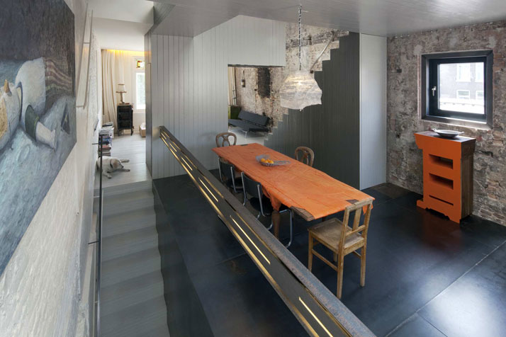
Rolf has made an unconventional intervention to an old and dilapidated building (Charlois, Rotterdam) and thereby turned it into a architectural landmark. By juxtaposing old layers of meaning and history with new layers of intersected walls and texture he's creating an interior universe full of tension and surprise. Has he turned an unpolished diamond into a pearl?  

photography by frankhanswijk.nl


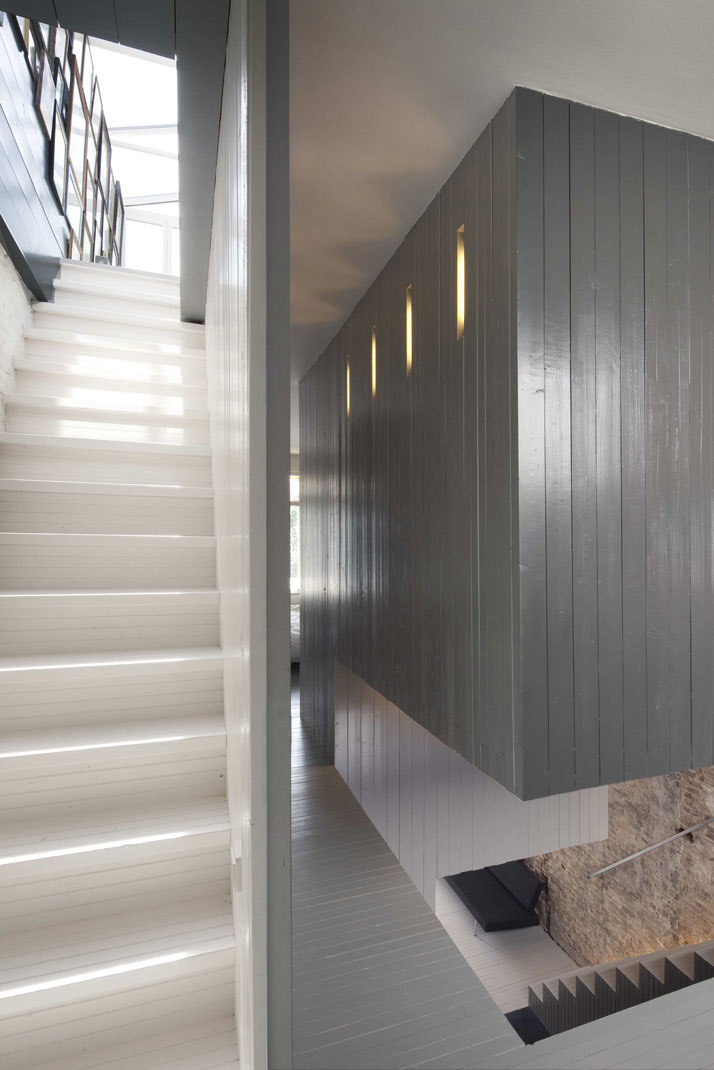
The old external structure has been left largely untouched, only all its internal construction was removed. This created a vast space (4 floors) into which a new structure has been inserted. The new structure is on the one hand created by a ribbon (of painted pine-wood laths) that runs through the space, it gives direction through the maze of fly-overs, undercuts and rooms. On the other hand the the new structure seems to be floating in space, it's detached and created completely independently from the old structure, sometimes the split is enhanced by dramatic embedded back-lighting. Some cut-throughs or fly-overs create dizzying heights and views so your sense of balance may also be challenged. In most places where old and new meet there is collision because there is no relationship. The stark white walls of the new frame the mixed textures of the old like one would a cherished memory of a dear one.
photography by Frankhanswijk.nl


Every time one turns a corner there is a new surprise in space, in dimension, in perspective and material. Artists like Gordon Matta Clarke experimented in the 70's to create interventions with a chain-saw on old buildings and ruins to create new architectural experiences and dimensions. Rolf has done something similar here,  only he has not done so by cutting material away, he has done so by the way he has designed the internal structure. Some walls are half high, others actually leave an open space at the bottom, sometimes the walls seem to just spontaneously stop or begin. You can sometimes find the same type of uncoordinated, unmotivated and illogic walls in public utility or housing buildings. Mistakes. The difference is that in this case the seemingly lack of coordination is carefully thought through to create an effect. 
photography frankhanswijk.nl


The material use is extremely  modest, low value materials like pine-wood and unpolished steel are upgraded through sophisticated treatments and use. The application of colors help create the effect of fictive rooms, I would guess there's probably only one door in the house, the one to the rest-room, nevertheless you continuously feel like entering another room.The only real color in this house comes from the orange that Rolf likes to use on the "scar-tissue" of his up-cycled furniture pieces that have also gone through an intervention.
photography Frankhanswijk.nl


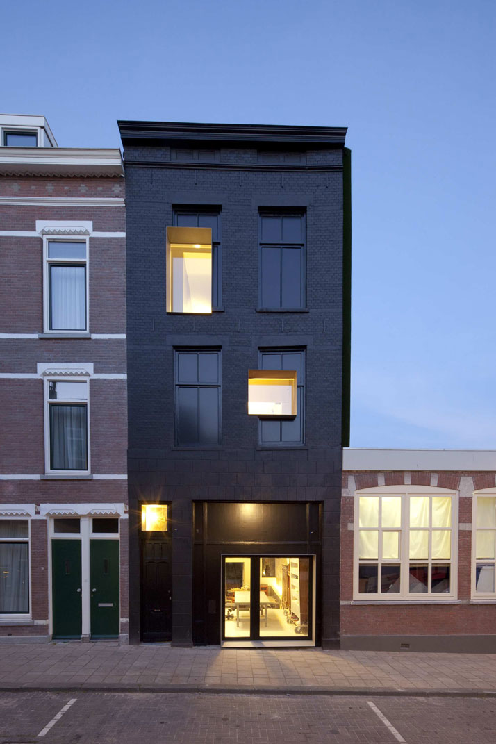
The facade looks as if the 3-dimensional space inside; the confrontation of old and new, has been compressed into a 2-dimensional surface. The old window structure is intact though blinded, and finished with black oil to leave only a lightly embossed trace of the past. On-top of this structure, as if paying no attention to the past, new window-frames have protruded themselves out through the surface, made in steel, one could almost mistake them for being chainsaw-cuts.
photography Frankhanswijk.nl


The interior of this house truly works like a spatial walk-in sculpture, the unconventional lay-out  continuously surprise, it tickles the senses with it's patchwork and contrast of textures. It's rough luxury at it's best, Arte Povera re-invented as interior architecture, breaking free from existing conventions about the organization of space and beauty.

architects; Rolf Bruggink (rolf.fr), Iffy, Marnix van der Meer (Zecc architects, Utrecht)
Related Posts Plugin for WordPress, Blogger...